Skip to main content
Search
Search This Blog
Barbara Hall Blumer
Fine Art Oil Paintings
Pages
Bio
TO BUY
More…
Posts
Latest Posts
February 02, 2024
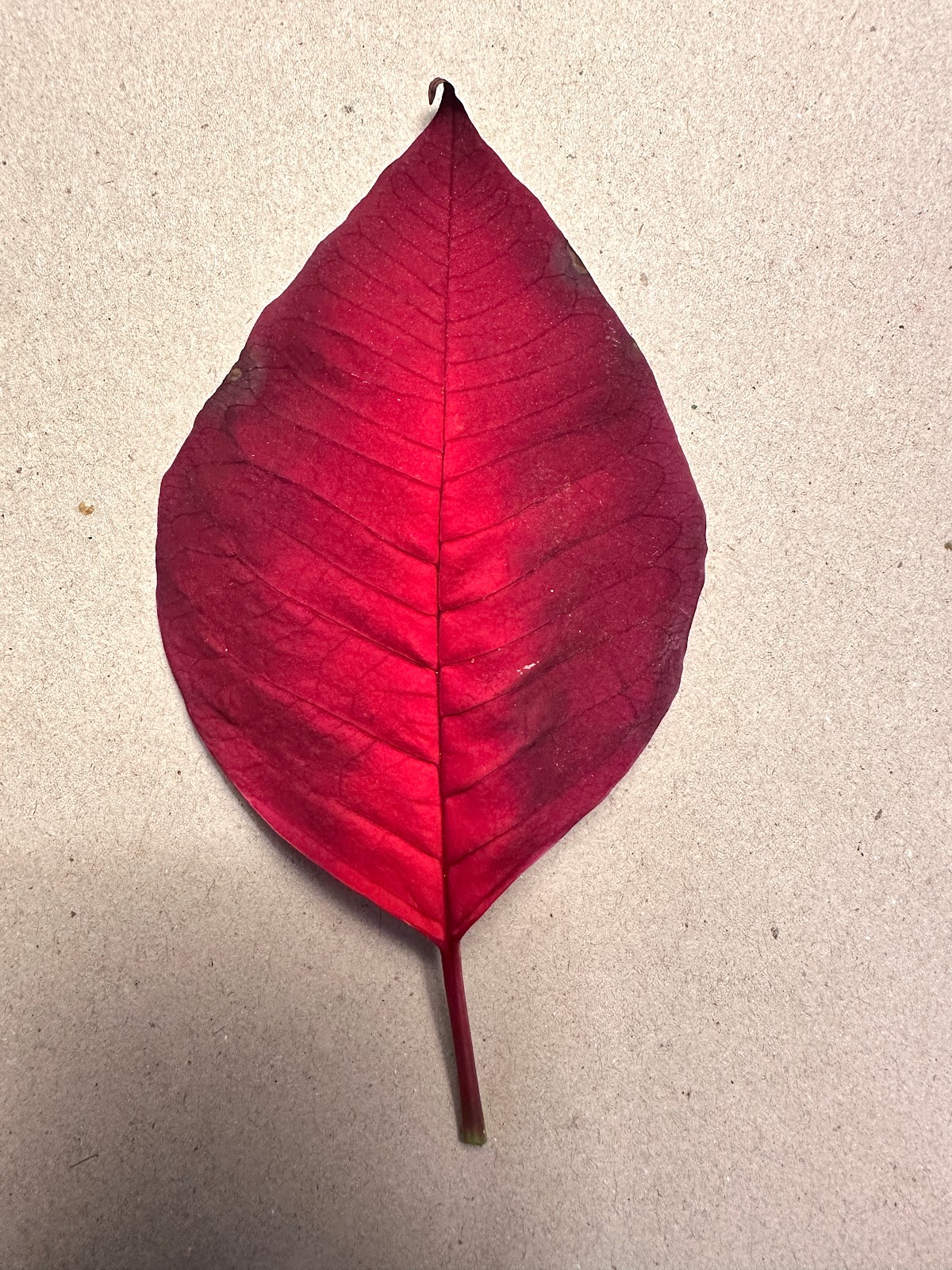
Looking Closely
January 21, 2024
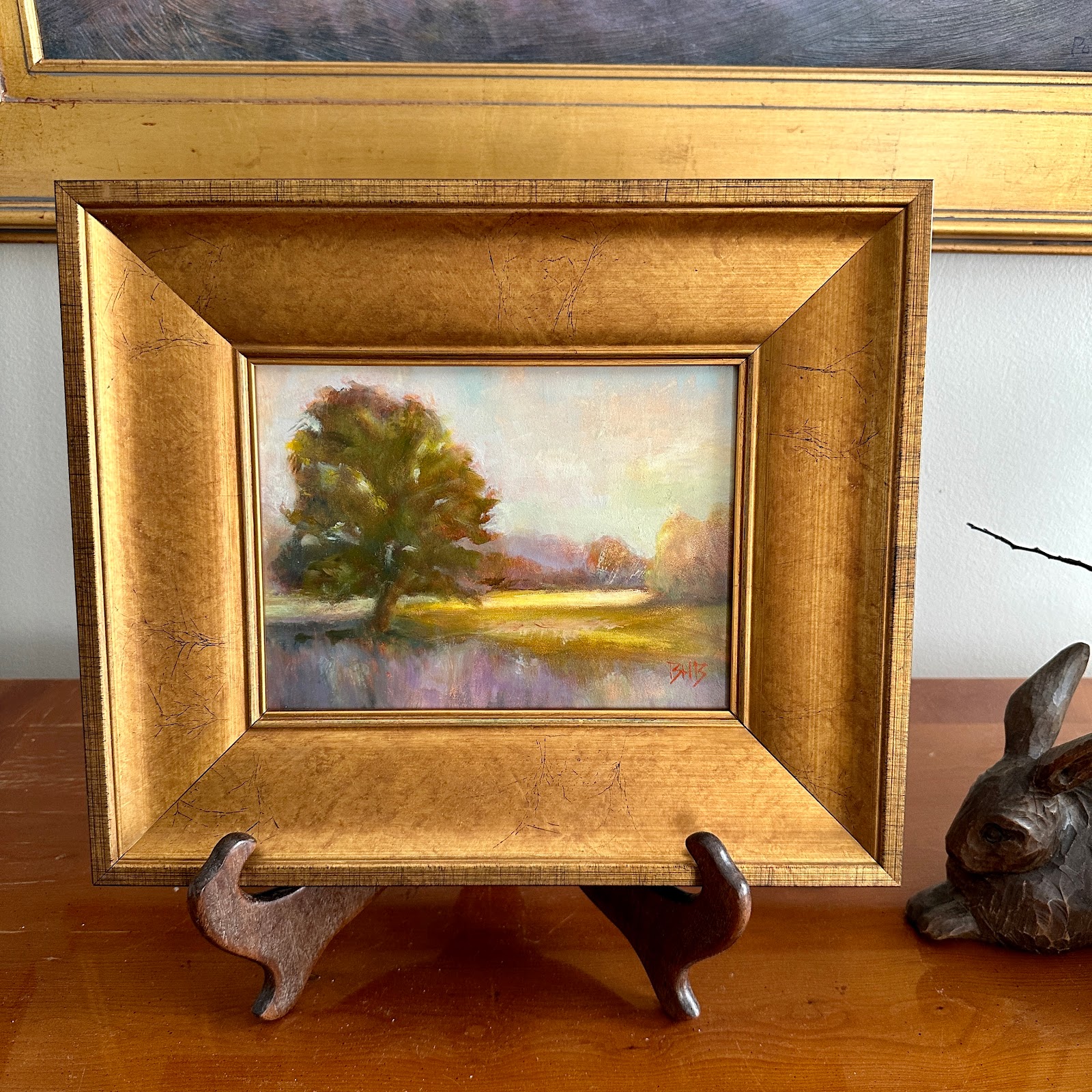
New Tiny Studio for a New Year
September 16, 2023
You never know who will pick what (Click to read full post)
June 15, 2023
“Everything looks better in a frame.”
March 15, 2023
Re-discovered
May 27, 2022
New Paintings for Yates Arts Show (Click to read post)
July 08, 2020
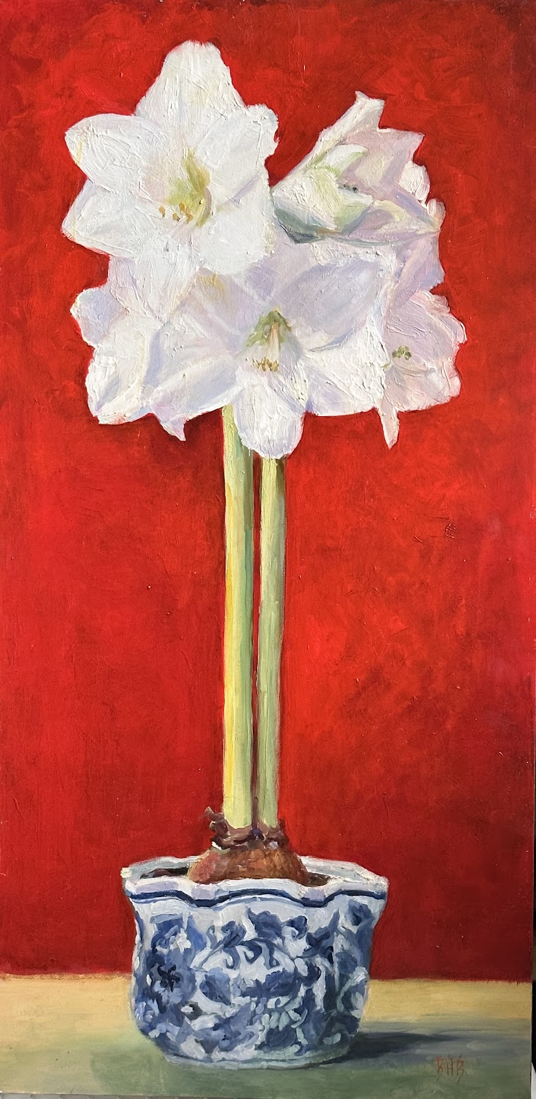
"Rabbit, Rabbit" Oil Painting
June 27, 2019
Studio Update and New Paintings
Click on the tab below to see my work
Paintings (Available)
Paintings (Archives)
BHB Gesture Drawings
Available Photographs
People Wall Website & Book